Red, Orange, Tan and Purple
from Amazon
* As an Amazon Associate, and partner with Google Adsense and Ezoic, I earn from qualifying purchases.
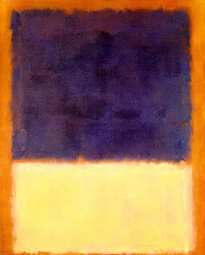
Mark Rothko had a signature style when doing his paintings. Red, Orange, Tan and purple was one painting that he did in 1954 that depicted his artistry in colour blending. Colour field painting on large canvases gave him prominence that made viewers be into his colour play. This particular painting was done in 1954 and was an expression of his thoughts. Red, Orange, Tan and Purple radiated what he termed as a manifestation of an artist.
Setting
Each painting that Mark Rothko did spoke distinctly of what it meant. The trips he had made to New York, France and Italy before gave him all the aesthetic solutions he needed. Red, Orange,Tan and Purple came out in soft edged rectangles .Furthermore, they had a floating appeal with the colours suggesting different occasions.
Style
This particular painting was done with a colour combination after he resorted to use colours to distinguish his works. He did this artwork as he focused on changing the artistry perspective. One noticeable trait, is the way he would change the orientation by inverting the canvas while working. This richly contributed to his unique work.
Close examination of this portrait brings out what he wanted. His aim was for viewers to have the intense and intimate feeling just by looking. You can feel the emotional unlock and mystery he wanted to depict. As much as museums wanted to showcase his work, he made it clear of his expectations as his work was more than a mere decoration.
Technique
The hazy painting on canvas pulsated shapes that were horizontal due to his inverted brushwork. However, he said they never purposed to bring out visible experiences on what was happening in his world. Though you can feel the passion in his work that he termed as abstract expressionism.
Influence
Mark Rothko came up with the colour field painting with expressionism through colour. His work is described to be formless, lineless patches of colour though they expressed whatever emotion he had. Moreover, he called his work an expression of ecstasy, tragedy and doom not just a colour mix. Artists such as Fred Nietzsche and Henry Matisse inspired his career to the peak.
Matisse used deep colours and shapes to saturate his viewers. This was a close influence to Rothko’s works in which he used colours that were easily identified and people could experience. Henry Matisse‘s work particularly, The Red studio was of immense value to Rothko.