Mark Rothko.jpg)
By early 1949 Mark Rothko's multiforms developed into the signature style; Rothko exhibited these new works at the Betty Parsons Gallery. For critic Harold Rosenberg, the paintings were nothing short of a revelation. Rothko had, after painting his first multiform, secluded himself to his home in East Hampton on Long Island. He invited only a select few, including Rosenberg, to view the new paintings. The discovery of his definitive form came at a period of great distress to the artist; his mother Kate died in October 1948. Much of his best work was produced during periods of extreme happiness or sadness, with these strong emotions fuelling much of his innovative work. They would also impact specifically the colour schemes that he used within his Color Field paintings, which increasingly became darker and darker over a period of several decades.
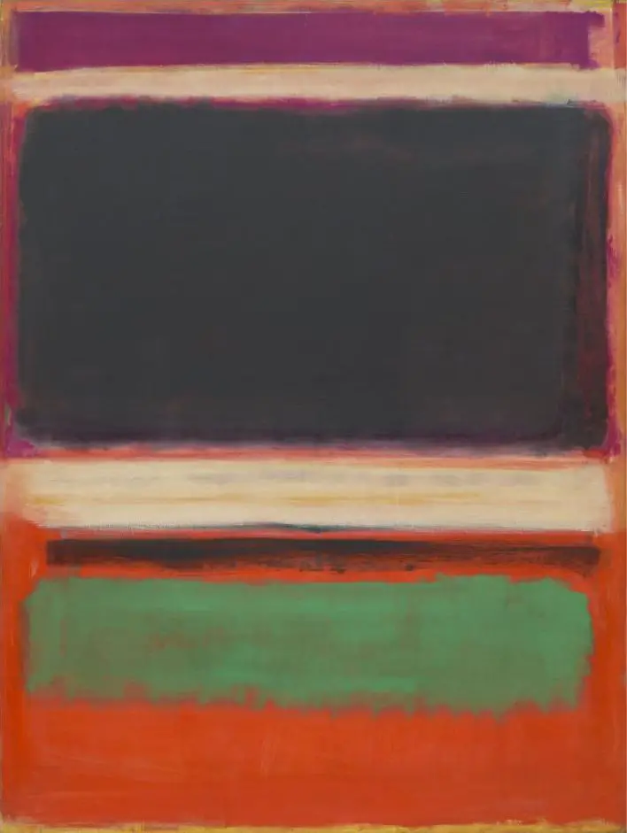
It was at some point during that winter that Rothko happened upon the use of symmetrical rectangular blocks of two to three opposing or contrasting, yet complementary, colors, in which, for example, "the rectangles sometimes seem barely to coalesce out of the ground, concentrations of its substance. The green bar in No.3/No.13 (Magenta, Black, Green on Orange), on the other hand, appears to vibrate against the orange around it, creating an optical flicker." Additionally, for the next seven years, Rothko painted in oil only on large canvases with vertical formats. Very large-scale designs were used in order to overwhelm the viewer, or, in Rothko's words, to make the viewer feel enveloped within the painting. For some critics, the large size was an attempt to make up for a lack of substance. In retaliation, Rothko stated:
"...I realize that historically the function of painting large pictures is painting something very grandiose and pompous. The reason I paint them, however... is precisely because I want to be very intimate and human. To paint a small picture is to place yourself outside your experience, to look upon an experience as a stereopticon view or with a reducing glass. However you paint the larger picture, you are in it. It's not something you command!..."
Rothko would put together huge rectangles of colour before working around the edges of each with multiple layers and effects in order to blur them with each other, and also into the wash upon the main background. In this case he chose to use a bright orange for the main colour of the canvas and would have added that first, prior to putting the shapes over the top. Interestingly, he leaves a large area of the canvas untouched at the bottom, from which the background tone can appear. This was unusual, as normally his rectangles would cover the entire painting, other than a small margin in each corner which served as a type of frame for the piece. His large canvases would not be framed in the traditionally way, of course, and so this was an alternative method of framing his composition. In other examples he would put some rectangles in a tone very close to the background, as a way of balancing the hierarchy of different shapes through how clear each one appeared to the viewer.
This artist would use a somewhat unhelpful naming convention for this style of work, normally with simple numbers or a selection of colours as used in the painting. He was also leave a large number of artworks entirely untitled, leaving academics and researchers with the task of documenting these works from across a number of decades. This has also led to the situation found here, where this painting is known as both Number Three, and also Number Thirteen. Fortunately, it uses a large number of colours which then makes it's title somewhat unique, but confusion can be found elsewhere with the series of red-toned paintings that become hard to differentiate. This scenario is found commonly within contemporary art, where content is not as obvious or easy to summarise. Compare that, say, to the Renaissance or Baroque eras where something like the Creation of Adam has a clear inspiration and content to name. In terms of contemporary art naming conventions, you will also see similar with the work of Jackson Pollock, who gave us the likes of No. 5 from 1948.
The large black cloud-like formation in the centre of the piece dominates your eyes, and creates almost a landscape scene within abstract shapes. The artist deliberately avoided naming his work in a conventional sense in order to encourage viewers to make their own minds up. One can take negativity and positivity from this painting in equal measure, depending on which colours you focus on more. A view of the piece in person will allow you to understand the sheer scale of this artwork and also to examine how the rectangles hover above the canvas thanks to the blurred edges and clever use of colour. Some have compared the piece to windows from a gothic church, whilst others see the dark cloud connection, meaning that the interpretation to vague, just as intended. The variety in colour makes this painting one of Rothko's most popular Color Field paintings, and it remains a popular choice as art print.
No.3/No.13 (Magenta, Black, Green on Orange) is a highlight within the extensive collection of the MoMA art gallery in the US. They own a large number of his paintings, close to 20 at the time of writing. These will be loaned out from time to time in order to allow art fans from across the country to enjoy more of this artist's work. Sometimes they may also be sent overseas as well, as part of a continuous collaboration between major art galleries and museums across the western world. Of the selection found at MoMA from Rothko, his surrealist work from earlier in his career is particularly well represented. No. 5/No. 22 is perhaps the most similar to this in terms of date and style, though that example uses tones of yellow, orange and red within a warmer demonstration on the new Color Field movement, though he continued to experiment with this style in as many different variants as one could possibly imagine over a period of two decades.