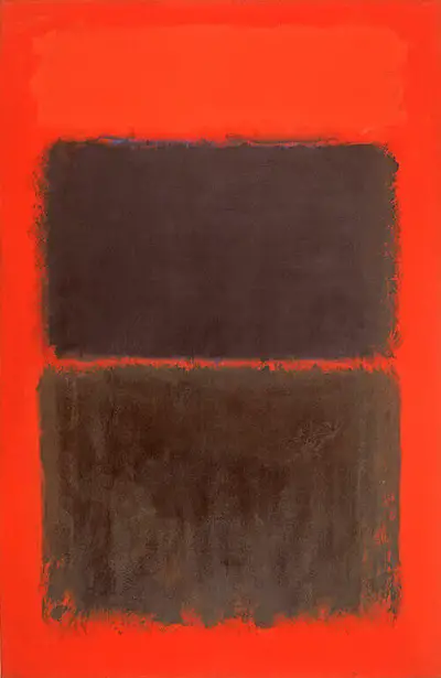
Rothko worked in this style without any real connection to reality. They were not intended to represent anything from the real world, and were merely about experience, perhaps just with a loose link to generic organisms. He developed this approach across the 1940s and so by the time of Light Red Over Black he was entirely comfortable in this style. It was entirely abstract and would essentially become how we all remember his career today, particularly for those who only take a fleeting interest in 20th century art. Rothko may have been capable of more technically challenging work, but this was his prefered route, after decades of experimentation. In this particular piece he chooses to section the work into three areas of colour, first light red and then two darker sections. They come close to merging, but a small gap appears between each which allows the background to show through. The top tone of light red is also very similar to the background, and so is almost invisible, leaving an initial impression of a large gap in that part of the composition, before you look a little closer.
The two dark regions feature a blend of black and blue pigments, whilst the borders are deliberately loose and hazy. One can be drawn into them when standing close by, almost mesmerised by these simple blocks of colour which hover in front of you menacingly. Some have compared this layout to a window but in truth the artist was not intending to recreate anything from reality but instead was happy to allow people to see whatever they wanted within his work from around the 1940s onwards. He would achieve different effects in this regard by experimenting with different palettes, as shown with the much brighter tones of No. 6 (Violet, Green and Red) and Untitled (Violet, Black, Orange, Yellow on White and Red), for example. He would be very hands-on with exhibitions in order to make sure that they huge canvases were displayed in the right way, so that viewers would receive quite the experience that he had intended.
As his mood fluctuated, so would the colour schemes that he used, with many darker tones appearing in later life. One can see this same comparison within a number of other famous artist's careers as well, such as Jackson Pollock who was famously unstable mentally and turned to art as a means of softening his health issues. Such problems have actually served as inspiration and fire to creativity for a number of painters across the 20th century. Rothko's style of coloured lozenges meant he could work fairly quickly and therefore had time to experiment with this approach in many different ways. Colour was a key element to modern art, particularly because detail was given less prominence, and so he could try out different combinations as he saw fit, safe in the knowledge that this style appeared to have achieved success and respect, taking much of the pressure of his life at that time.