This large canvas is over two metres in height and width, which was entirely typical of the artist's work during this period. He wanted colour to dominate, and so would produce paintings that could stretch out beyond your peripheral vision, essentially allowing the artwork to completely take over your senses. There was no connection to reality within these paintings, it was for Rothko all about providing an experience to the viewer that they had never had before within an art gallery. It is fair to say, therefore, that in order to truly appreciate paintings such as Blue, Orange, Red, then you must really see it in person. We believe it to be within a private collection and so this is unfortunately not likely at the moment, but many more of his paintings can be found within public art galleries and museums, mostly in North America and Europe.
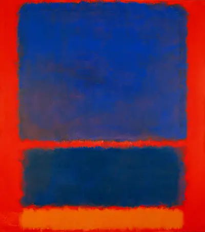
The most memorable part of this particular work would have to be the clash between the tones of blue and red, something that the artist would have completely intended. The result is a shock to the eyes, as normally Rothko would use more subtle tones for his background, and just allow it to work quietly behind the main shapes of colour. He liked to leave small gaps to allow the background to show through, and in some cases actually provide a little balance but in Blue, Orange, Red he decides to be far bolder and gives the primed surroundings a far greater prominence through his choice of tone. Another point to note is how the artwork is top heavy, with larger shapes at the top, slowly reducing in size as we go down the painting. This could give us all manner of ideas, such as rising smoke, or an element being squashed over time. Rothko was happy for viewers to see whatever the liked in his abstract works.
Rothko would use tones of blue in many other works in order to create all manner of different effects, some just as shocking as this, whilst being more subtle in other examples. You would do well to check out the likes of No 1 Royal Red and Blue, No. 61 (Rust and Blue), Untitled (Yellow, Red and Blue), Untitled (Yellow and Blue) and also Untitled (Blue Divided by Blue). You will find a great variation in tone and layout just within that small selection, and this was someone who loved to try out new arrangements all the time. By the end of his career Rothko must surely have been comfortable in the belief that he had taken this style just as far as it could possibly go and few could really argue with that.