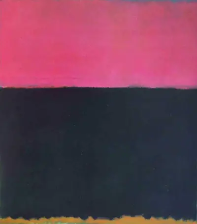
The lower half of the painting is a dark grey tone which contrasts beautifully against the brighter colour above it. At the bottom there is a small part of the canvas that shows the background layer through. Rothko would experiment with different layouts, normally leaving a narrow gap between the main areas of colour. In this case they meet up right to the edge and this gives a more precise finish. He would continue to experiment in this way for several decades, as well as alternating his choice of palette. Ultimately, by the end of his career he would exhaust all possible combinations within this movement and had hundreds of canvases to outline this. You will therefore be able to see the two main colours used here repeated in other variations elsewhere, particularly within the 1950s and 1960s which is when he devoted the most time to this abstract style. More on this life can be found within this biography.
Rothko enjoyed both bright and sombre palettes within his career, often jumping from one to another and then back again within the same month, even week. He also would combine them together in some cases, such as found here with Untitled, 1953. In his later years he concentrated more on darker themes, which some have suggested was a direct comment on his own mood which is known to have become more negative by this stage. Others have rejected this suggestion, stating that he still produced some bright artworks even deep into the 1960s and therefore he was most likely just continuing to experiment in new ways that he had not covered in detail as much previously. In terms of his use of pink-ish colours, you will find similar tones also used within No 1 Royal Red and Blue, White Center and Green and Tangerine on Red.
American art would dominate throughout the 20th century, particularly within the second half and Mark Rothko would play an important role within that. He was a key figure within the New York School which specialised in contemporary art and gifted us some highly prominent names. Rothko himself was best known for his Color Field work but he also produced considerable numbers of Expressionist and Surrealist artworks, partly inspired by some of the best European artists of the time, as both continents would continue to feed off of each other. He was impressed by the likes of Miro and Mondrian for example, but later who actually influence Europeans in the opposite direction.