The artist's goal was to abandon any visual obstacles detracting from the central idea. Rothko's paintings, heavy with implied content and emotional impact, ventured beyond abstract representation to embody the drama of humanity. In Rothko's compositions, the rectangles and their surrounding space are given equal importance as presences. Rothko paid close attention to height, width and edges of his soft-edged forms, their distance from the sides of the canvas, and their interrelationships. His soft shapes fuse into their surrounding space. The dominance of each shape depends on their color, which Rothko blended and layered to create variations in luminosity and surface texture. He frequently applied paint with rags, rubbing wet colors together, so that few gestures were visible; at other times he painted with slightly built-up brushstrokes for textural variation.
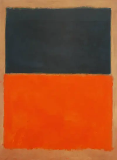
In many cases translucent underlayers of color are visible, evoking a quality of inner light. Green and Tangerine on Red is composed of two massive rectangles, one dark and one light. Marjorie Phillips, Duncan Phillips's wife, recalled Rothko's assertion that "the striking tangerine tone of the lower section of [Green and Tangerine on Red] could symbolize the normal, happier side of living; and in proportion the dark, blue-green, rectangular measure above it could stand for the black clouds or worries that always hang over us". This statement expresses the opposing emotional states that Rothko's works can evoke. Through countless color manipulations executed on a large scale - an approach comparable to that of a composer arranging musical notes - he created powerful, timeless absolutes of human sensation ranging from exultation to torment.
It is important to remember that Rothko's palettes dipped into darkness across the 1960s, reflecting his more negative mood. Here he is clearly balancing positive and negative emotions in a more healthy manner and the two contrasting tones work well together. The public seem to prefer his brighter pieces too, although his later period does help us learn more about the man himself, as we can compare his changing personal circumstances and outlook with the direction of his oeuvre over time. The relatively neutral tone selected for the background of this painting also helps the main two blocks of colour to stand out as much as possible.