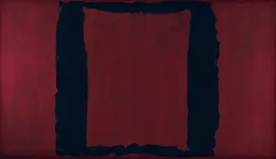
Artist Rothko's style would begin to darken considerably as we moved into the latter half of the 1950s. A key contributing factor to the change would be a commissioned mural for the Four Seasons restaurant which can still today be found in the Seagram Building (hence the term Seagram murals) in New York City, USA. Mark Rothko chose to complete this project using a palette of red, maroon, brown and black tones, which clearly differed considerably from his more common use of reds, oranges and yellows up to that point. He would later pull out of the project completely and reject the commission because of his concerns about providing art for a restaurant and whether this may actually damage his own artistic integrity, particularly as he was someone who was famously hands-on in how his work would be presented to the public. That is not to say that the work that he produced in planning this project was not valuable however, in fact quite the contrary is true as there were several unique elements to the preparatory pieces that he came up with which deserve a closer look.
We immediately find in front of us here an intriguing shape, almost a window, as Rothko moves away from his standard routine of single blocks of colour arranged together on top of each other. Here we have a black outline which forms a square shape, but with the background then showing through the middle. It is most likely that this new direction was inspired by elements around the building in which the pieces were meant to be placed. There must have been some sort of connection between this open window style and touches of the architectural design with the Seagram Building which would have made this an entirely rare customised work specifically for the recipient and host of the commissioned piece. The items that were eventually produced are still well known to us and form an important part of the artist's oeuvre, even though the overall project was not completed to the original intention.
This artist's career was far more diverse and interesting than most of the public realise. Even within the Color Field items, there was variation of palette and form, as underlined here. There was also his earlier periods of Expressionism and Surrealism within a huge body of work, plus drawings as well. Only those who take the time to study his career in more detail will be aware of this, sadly, as most of the media within the west will focus purely on the style that he remains most famous for. The artist's catalogue raisonne is also the other means by which we can truly understand the full breadth of his work and that remains the best resource on his career currently available.