The edges of the rectangles are never distinct, avoiding an optical break and allowing viewers' eyes to move quietly from other area to another in a contemplative way. Rothko did not want us to think about him when looking at his paintings, so he tried to remove all evidence of the creation process. To accomplish this, he applied numerous layers of thin paint with a brush or rag to unprepared canvas, which absorbed the colors into its fabric. The many thin washes help to give his paintings a lightness and brightness, as if they glow from within. Orange and Yellow was considered quite large in the 1950s, and Rothko asked viewers to stand close in order to be visually surrounded by the colors. His goal was for color to, in his words:
"...Express basic human emotions - tragedy, ecstasy, doom. The people who weep before my pictures are having the same religious experience I had when I painted them. And if you, as you say, are moved only by their color relationships, then you miss the point..."
Many of Rothko's paintings would be over two metres tall and wide enough to essentially overwhelm the viewer, who would eventually feel a part of the piece if they retained their view for long enough. He did not intend these pieces to merely be glanced at, but viewed for some time until you could feel a part of them. That said, Rothko did understand that no-one would ever understand his work as well as himself, but he hoped the basic ideas of human emotion would be understood through his use of colour and abstract shapes. The artist would alter his colour schemes across his career in order to reflect different moods, with earlier bright colour schemes later being replaced with darkness, such as with Untitled, Black on Gray from 1970 - the year of his death.
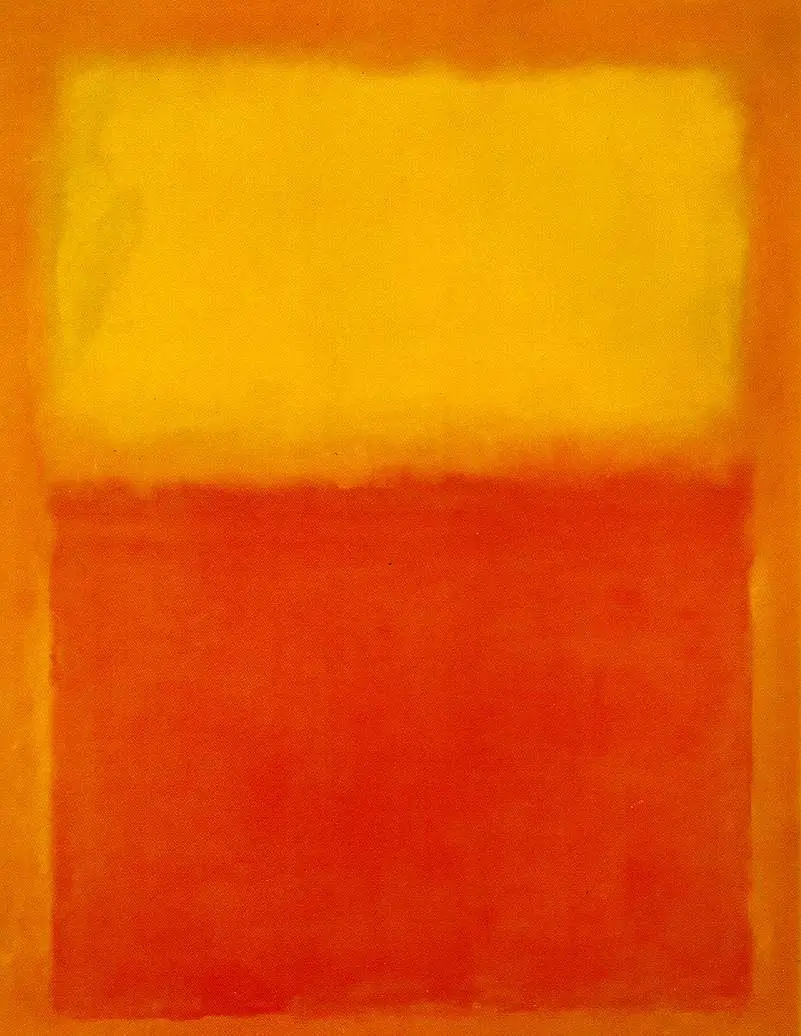
Thankfully, his more positive colours are found across an extended period of his career and these tend to be more popular with followers of his work. Few will order prints of his black paintings, for instance, where as items such as that captured here, as well as Orange, Red, Yellow and White Center continue to prove particularly popular. Red was a colour that Rothko explained several times of its importance to him, and so it is not surprising that he used these warm combinations from time to time. In our example here, Orange and Yellow, he placed two clear rectangles of colour over an orange wash, before then adding blurred layers around the shapes in order to loosen up the respective forms. This allowed the shapes to feel more flexible in appearance.
During the time in which Rothko peaked as an artist, New York was perhaps the central location for global art. He was helping to shape that, along with other members of the Color Field movement. One would also later see the work of artists like Basquiat who continued the exciting contemporary styles appearing across the States from after the end of WWII. The nation was also aided by an influx of immigration from various parts of the world which brought in a constant stream of new ideas and influences. Rothko himself was born in Latvia and many had already seen the success of artists like Kandinsky who had made the journey west. We can, of course add Warhol into that list as well. This was an important moment in western art, as Europe had dominated ever since the middle ages, and it was not time for America to not just watch and learn, but to actually lead as well.
Orange and Yellow from 1956 can now be found in the collection of the Albright-Knox Art Gallery in Buffalo, NY, US. The artist's work within the Color Field movement had begun in the 1940s and so by the mid-1950s he had spent a good few years developing this approach. He would add multiple layers of oil in order to create a beautiful luminosity to his work and would always encourage visitors to his studio to stand close to his work in order to allow it to take over their emotions. He had not always worked in as abstract as style as this, but he had now found his calling, artistically, and would continue along this path for the rest of his career. By the time he hit the 1970s he would start to turn away from the positive mindset and start to focus on negative emotions within his work.
The Albright-Knox Art Gallery has a beautifully balanced selection of original art on show. Whilst covering the post-1940s contemporary art scene with the likes of Rothko, they also have plenty of coverage of movements from before that too, leaving a comprehensive survey of European and American art from the last two centuries. Those featured who may be of particular interest include the likes of Paul Gauguin, Vincent van Gogh, Jackson Pollock and Piet Mondrian. There is also a good number of impressionists artworks included here too. Contemporary art is particularly well served within the US and the most obvious reason for that would be that many of the great artists post-WWII have been from this particular country, ensuring a constant local interest in such styles.