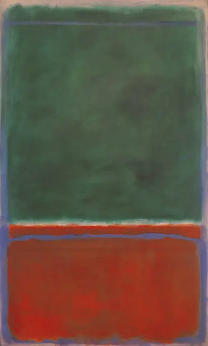
The artist chooses to slightly darker his main colours in this painting, making the finish somewhat sombre. There is not the brightness found elsewhere during the 1950s. The blue and white lines also separate the main blocks into different parts, reducing their effectiveness and visual strength. It appears that most likely these lines were added after his initial tones of green and maroon, perhaps an afterthought as he would often not pre-plan his work. Much of contemporary art was about being spontaneous, so this was nothing new. He would use these same tones again elsewhere, but never with this peculiar formation of lines around the edges, which went against his normal technique of framing his canvases within the composition.
Many of those who view Rothko paintings online, rather than seeming them up close in person, will be completedly unaware of the finer intracacies which he carried out within the rectangular groups of colour. Many different mediums were used, rather than just the traditional brush, including dabs of rags and also elements of glue. Only when viewing these huge pieces up close will you be able to understand these variations, nor understand the sheer scale of these canvases. They were sized in order to be wider and taller than the viewer, so we could stand in front and slowly start to become a part of the painting itself. This is far from traditional art, when we are the viewer of something majestic, but not intended to feel a part of it as such, merely to appreciate it.
Rothko decided to go with his Color Field approach for several decades and during that time would produce all manner of different arrangements, some vertical, some horizontal. There would be a plethora of colours used across the different iterations and over time he slowly became darker and darker. Eventually, his hazy edges would be replaced with harsher lines as things developed into something more negative in atmosphere. He used human emotion as an inspiration for his work, but his own feelings must have influenced this change late in life. It was particularly across the 1960s that darker elements would enter his palette choices, no doubt reflecting his own personal life and some of the problems that he was experiencing at the time, see the Rothko Chapel, for example.