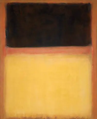
Here we find a single strip of orange or earth colours, that lies on a narrow band between the two larger blocks of colour. The top is dark grey or black, whilst yellow is found below in the largest section. The border around them all is a similar tone of earth which allows the painting to breathe. The artist worked in this style for many years and although his oeuvre was actually fairly varied, most know him purely for his work in this style. He liked to provide an experience to his viewers when they visited galleries displaying his work. He took time to arrange the displays just as he wanted, so that the precise experience could be delivered. He was particularly keen to see people engulfed by colour, shocked and excited by the incredible scale of these large mural-like canvases. Reality was left behind and replaced with a new world in which one could truly lose yourself. The palette used here gives an unsettling balance to the piece, almost like a dark cloud hovering above your head as you walk outdoors.
Rothko worked hard to increase the luminosity within his paintings via a number of different artistic techniques. Those who have seen No.9 (Dark over Light Earth) in person have marvelled at the level of luminosity found specifically within this painting, marking it out as one of his best. It was produced in 1954 in a typically large format and by this point the artist was entirely comfortable in working within the Color Field style, with he himself actually being the spearhead of this movement. Despite actually rejecting the label, or even his connection to the movement, this artist had achieved fame and was now to be linked to this abstract style of art forever, wherever he approved or otherwise. He would work effectively in a number of other movements besides this, such as Surrealism and Expressionism, but those earlier phases of his career rarely receive anything like the attention of this later spell.
The artist would stop giving unique titles to his work by around the late 1940s and so many of his abstract pieces were left untitled, leaving exhbition curators with the task of finding ways to differentiate them in a helpful way. Generally the would refer to the colour schemes in brackets, sometimes adding the year as well if these were common combinations. They also might simply number them from across each year's output which was a good method for when it came to constructing the artist's catalogue raisonne, which was a real success and continues to be the best resource on this artist.