This made it one of the most valuable purchases from Rothko's entire career, though much of his work is now held in public institutions and unlikely to come up for sale. The prices, therefore, have been pushed up considerably by this apparent lack of supply and so any Rothko paintings that do come up for sale on the open market will likely now command exorbitant prices. There has also been a widening of wealth, globally, in recent generations and the prize of owning significant European art can have many benefits to nations abroad. For example, some oil rich regions are attempting to diversift their economies in order to protect them in the future, and tourism can be boosted through the construction of notable art galleries and museums.
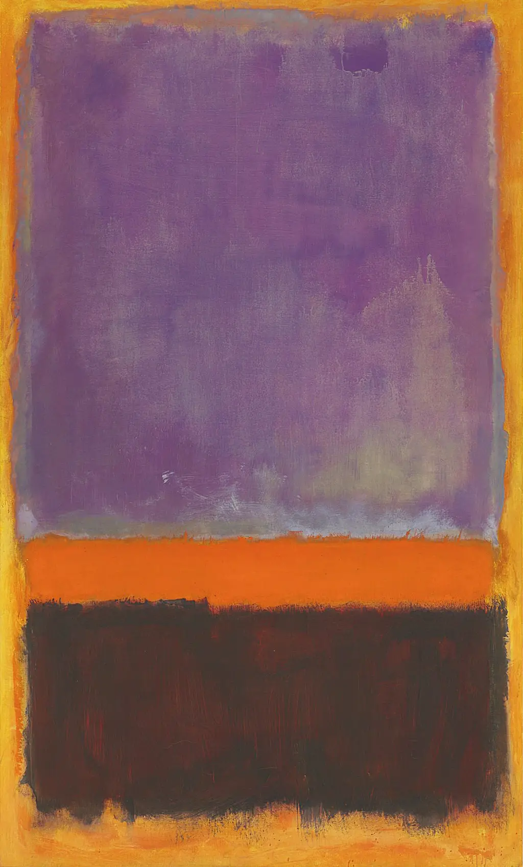
Rothko had worked in a style closely associated with Surrealism during the mid-1940s before starting on his career-defining journey which brought about the inception of the Color Field art movement. This approach was known for the use of rectangles of colour which were loosened at their edges in order to phase different parts of the painting together. In this example you will see from the larger image below that the blocks of colour were not in any way uniform, but full of variation within the rectangle, though more so within Untitled, 1952 than with most of his other paintings. We find stains of lighter tones and very rough edges to each of the three main shapes. Rothko would normally begin with a single tone to cover the canvas, before adding forms on top. In this case, the background is a tone of orange, with pigments of brown used in places.
The early period of the Color Field movement, for Rothko at least, was filled with bright colours which immediately drew a following within the United States, and eventually beyond. He had appreciated and learnt from the earlier work of Matisse and now understood the importance of colour above almost any other element of art. From that point onwards he would spend time planning his colour combinations as well as deciding how to place them together in order to achieve different impacts. He later admitted that he wanted to represent different human emotions within his canvases, but was not specifically expressing his own emotions when creating these pieces. The huge sizes of his canvases were deliberately aimed at allowing the viewer to become engulfed by the piece, in order to truly feel these emotions within their own minds.
When academics discuss the output of Rothko during 1952 it can be hard to differentiate his different paintings, as most were left untitled. In fact, according to the Catalogue Raisonne released in the 1990s which captures all paintings from his entire oeuvre, there were actually nine different untitled paintings from that year, though some were later appended with colours in order to separate them more clearly. Typically, the key colours of each piece would be added to the title in brackets, otherwise we would simply have to rely on the estate numbers which would be a less natural method of identification. Modern art since the 1940s has been well known for artists releasing work in this way, where as previously there was a much more sensible method to naming individual paintings. That said, Rothko's work across two decades is relatively similar and repeated across more than one hundred paintings, meaning they are harder to give unique titles, when compared to say portraits or landscape art from the Renaissance or Baroque eras in Europe.
"...It's a risky business to send a picture out into the world. How often it must be impaired by the eyes of the unfeeling and the cruelty of the impotent who could extend their affliction universally!..."
The artist would eventually move on from his brighter paintings as he became concerned about how they were being displayed. Sometimes he was able to direct the curators in order to achieve the display he wanted, but other times he felt that his work would be lost within huge expanses of wall space, and that they would be reduced to little more than decorative items. He hoped that by moving away from the brighter colours of paintings such as Untitled, 1952, that darker contrasts might be treated differently. His preference was normally for work to be placed close together and without too much space in any direction from the canvas. By forcing viewers closer to his paintings he could help them to understand the experience that he was trying to enforce. This may have also stretched to when he donated some of his own work, later in life, and potentially may have requested influence in how they were to then be displayed, at least in the short term.
In order to facilitate the recent repair of Black on Maroon, the Tate Gallery in London was tasked with researching the painting techniques of Mark Rothko in incredible detail in order to faithfully match the original condition. The artist was famously secretive about his working practices and did not like anyone being around when he was working. They were slowly able to uncover materials such as oil paint in several tones, some additional acrylic paint, plus also some glue tempera and further pigment, all of which were intermingled onto his huge canvases. Whilst that work came around six years later, it is highly likely that much the same process was used for this painting as well. Most initially see only oil work in his paintings, from a quick glance, but actually there were many levels to these designs, both in a philosophical and technical sense.