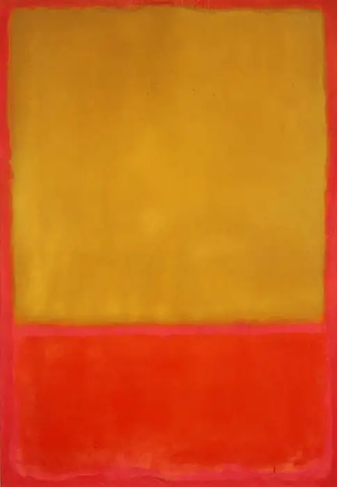
Ochre and Red on Red
from Amazon
* As an Amazon Associate, and partner with Google Adsense and Ezoic, I earn from qualifying purchases.
First, the Ochre and Red on Red consist of a red-orange colour field situated below a yellow colour field on a dark red background. Due to his use of a translucent layer of paint on this canvas, it is notable that Rothko has established an inner light in the painting. In fact, this luminosity creates a radiating warmth in the drawing.
A Detailed Overview of Ochre and Red on Red Painting
Mark Rothko painted the Ochre and Red on Red in the 1950s when he painted plenty of large drawings. Notably, his paintings during this period contain a similar format. However, they vary significantly in mood based on their internal proportions and colour. He is regarded as a formalist artist whose main objective was to arrange the colour fields on a flat painting.
In his words, he denoted that his art consisted of the human experience distillation in its purest form, both thrilling and tragic. He intended to stay away from the visual obstacles that could distract him from the core idea. Mark’s heavy drawings boast both emotional impact and indirect content. They are expressed beyond the standard representation to symbolise the humanity drama. Through the purity contained in his canvases, their impact on the user has become more intelligent and direct.
An Overview of the Used Colours
The raging yellow colour in this art creates a buoyant effect. Compared to the dark red colour on the surroundings, the yellow colour seems to flow out of the image into the viewer’s location. By manipulating several colours on a large scale, Mark Rothko was able to develop a technique comparable to that of a musical composer arranging some musical notes.
In the end, he painted timeless, powerful absolutes of the human sensation that ranged from torment to triumph. This painting, in particular, has become a good example of Mark’s highly emotional canvases due to its vibrant colours and high-keyed pigments.
Final Remarks
Mark’s mature works, such as this painting, were regularly drawn on a large scale. With this, it was possible to enhance their dramatic impact, making it easy for the viewers to put themselves inside the composition. This way, it elevated the viewers’ personal experience. One notable thing about Rothko is that he oversaw the setting in which his drawings were displayed in order to communicate his vision to all viewers efficiently.
So, he saw it fit to have his arts hanged separately from the other artists' work. He preferred dim lighting to make it easy for the drawings to dominate the surrounding setting. All of this ensured enhancement of the viewers' mystical essence.